as far as aesthetics go, i think i balanced this image well. i played around with color, trying to draw the eye further down (purple van to purple flowers). i also tried to tie in the color of the sky with the peace sign on the side of the van. i originally wanted to place my information in "bumper stickers" on the back of a bus or van. seeing as though i didnt have these images at my disposal, i worked with what i had. i think the angle of the bus worked well to draw the eye into the image. perhaps i could have played around on placement as far as the information text went, but pending circumstances i made a mad dash the finish line. i spent DAYS coming up with this design, and i hope everyone is pleased. as an avid fan of the woodstock era, i found this project to be very enjoyable. the style, i would have to state as being a post modern style.. it doesnt necessarily fit any other description, but with the font and content of the poster fit the time period.
the end.
Monday, May 14, 2012

it all comes together.


.jpg)
.jpg)
.jpg)
first poster idea
 picture of a volkswagen beetle i took around the corner from my house
what i turned that picture into.. decided to go another route...
sketchbookings for history poster
 i always have a lot of ideas...
 and lots of ways to implement those ideas.
 sometimes i get a little side-tracked...
 but it all comes together in the end :)

Wednesday, March 28, 2012
homage to van gogh
well, here it is. my blood, sweat, tears and time went into this. (not really.) (except for the time part.)

Monday, March 26, 2012
thumbnails

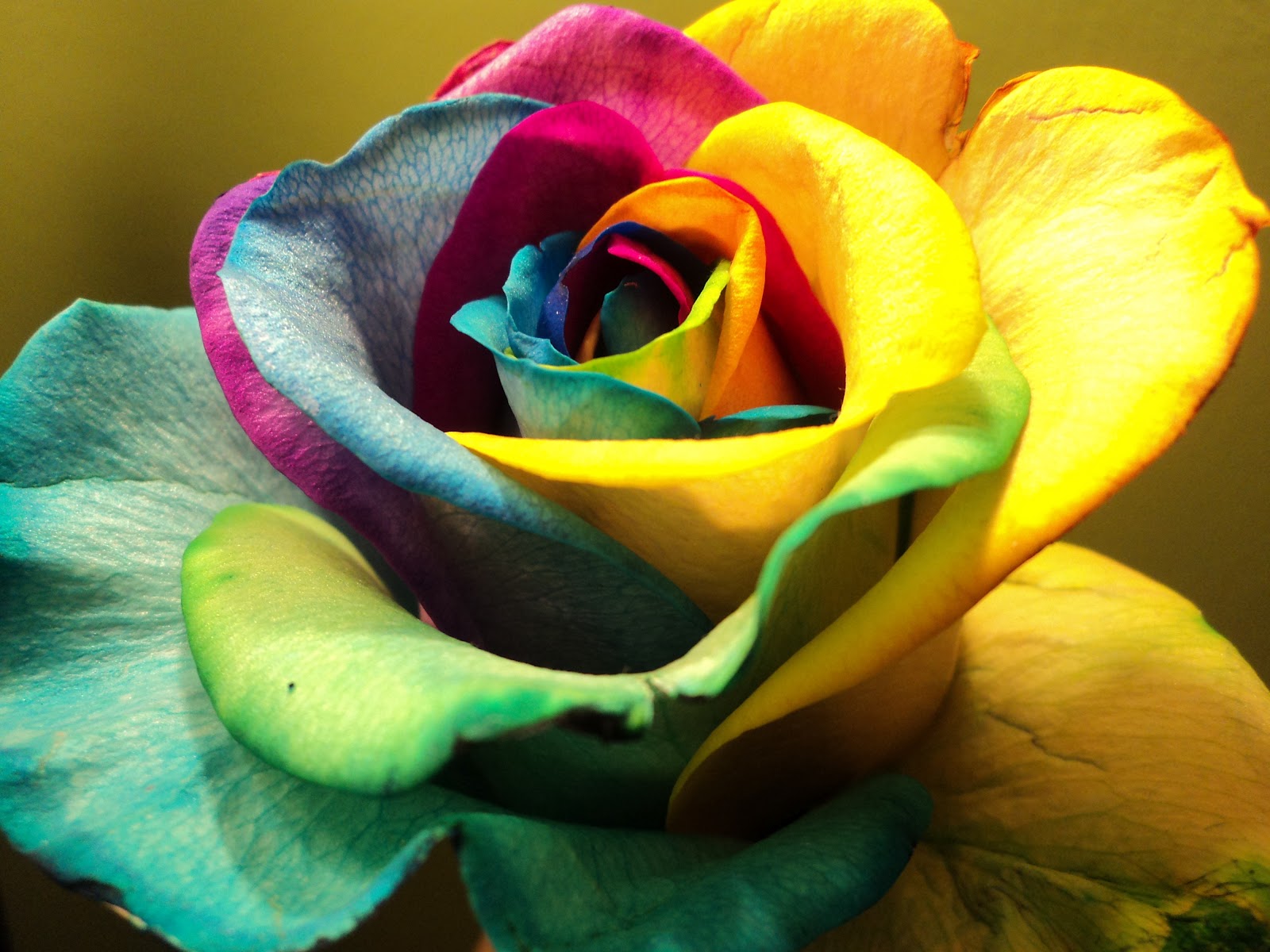
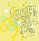
let me inspire you.
where the heart is willing, it will find a million ways.. where the heart is unwilling, it will find a million excuses.
follow your heart, but take your brain with you.
:) yay monday.
follow your heart, but take your brain with you.
:) yay monday.
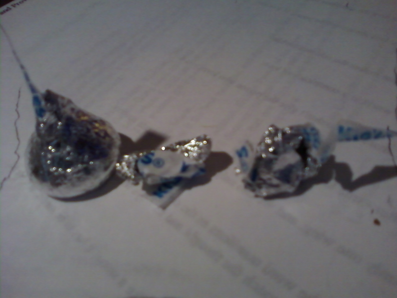
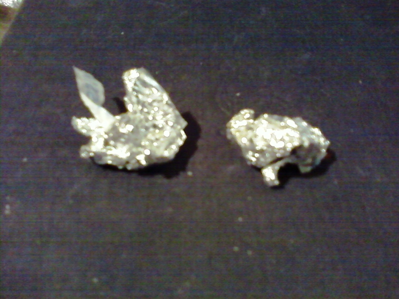
messy kisses
i took these a long time ago, with a cell phone... i thought the idea would be cool, but im not sure how good it'll look if my photos are blurry... maybe i'll just have to go out and buy a bag of kisses... darn!


.jpg)

.jpg)
Wednesday, March 21, 2012

Wednesday, March 14, 2012

ohh photoshop.
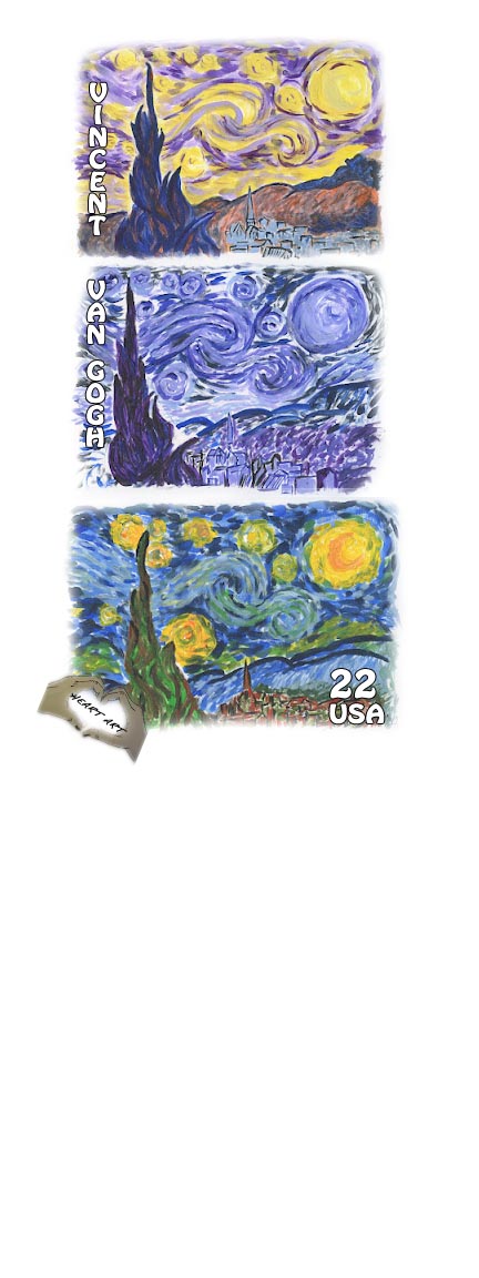 it shows up super small... which sucks, but this is my first stamp. i'll probably end up playing around with the borders and font, color and orientation. heart art :)
inspiration for my stamp (my own personal photography and/or art)


.jpg)


Monday, March 12, 2012
examples of art nouveau, with a touch of modernism...


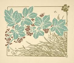
-all these images represent tactics used in both art nouveau and modern art.
-although these two artistic movements differ, in origin and tactic, they can carry some of the same feel... -use of color is a very important element regarding to both an art nouveau approach and modernism.
-a crucial defining difference between these two movements is the organic shape versus the geometric shape.
-in all there is an emphasis on floral, botanic and nature based motifs.
-spontaneous with shapes and negative space.
three favorites
i dont know if my blogger is just being silly or i clicked the wrong button, but im going to try and post this again. my three favorite stamp designs... it was SO hard to choose.
.jpg)
- fits within the art nouveau content guidelines- blocks of color. curved, organic lines.
- has an analogous color scheme
- from information content we can see this stamp comes from the netherlands, was put out in 2008 and cost 22 euro (cents?)
- has a very balanced design
.jpg)
second stamp
- also fits within the art nouveau description, but can be seen as modernism art- contrasting color palette throughout the entire design, but as individual stamps... well, still contrasting considering the background color
- informational content shows us this is a united states stamp
- very balanced, simple, organic and calm design
.jpg)
third stamp
- fits in with the international typographic art, but also can be seen as modernism art
- analogous color schemes throughout each block of 'color', but altogether creates a contrasting color scheme.
- informational content shows us that the stamp is a 100 year commemorative stamp, coming out in 2010. i am assuming it originated in switzerland
- formal design. incorporates the use of vertical alignment, center image gets the most attention... seems to be symmetrical.
Subscribe to:
Posts (Atom)