i dont know if my blogger is just being silly or i clicked the wrong button, but im going to try and post this again. my three favorite stamp designs... it was SO hard to choose.
first stamp
- fits within the art nouveau content guidelines- blocks of color. curved, organic lines.
- has an analogous color scheme
- from information content we can see this stamp comes from the netherlands, was put out in 2008 and cost 22 euro (cents?)
- has a very balanced design
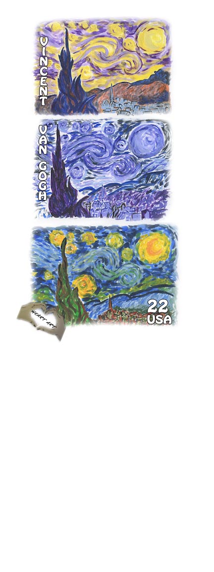
second stamp
- also fits within the art nouveau description, but can be seen as modernism art
- contrasting color palette throughout the entire design, but as individual stamps... well, still contrasting considering the background color
- informational content shows us this is a united states stamp
- very balanced, simple, organic and calm design
third stamp
- fits in with the international typographic art, but also can be seen as modernism art
- analogous color schemes throughout each block of 'color', but altogether creates a contrasting color scheme.
- informational content shows us that the stamp is a 100 year commemorative stamp, coming out in 2010. i am assuming it originated in switzerland
- formal design. incorporates the use of vertical alignment, center image gets the most attention... seems to be symmetrical.


.jpg)
 it shows up super small... which sucks, but this is my first stamp. i'll probably end up playing around with the borders and font, color and orientation. heart art :)


.jpg)


.jpg)
.jpg)
.jpg)

.jpg)


.jpg)
.jpg)
.jpg)
.jpg)
.jpg)
.jpg)
.jpg)
.jpg)
.jpg)
.jpg)
.jpg)
.jpg)
.jpg)
.jpg)
.jpg)
.jpg)
.jpg)
.jpg)
.jpg)
.jpg)
.jpg)
.jpg)
.jpg)
.jpg)
.jpg)
.jpg)
.jpg)
.jpg)
.jpg)
.jpg)
.jpg)
.jpg)
.jpg)
.jpg)
.jpg)
.jpg)
.jpg)